Forms are often the unsung heroes of conversion optimization. Whether you’re collecting leads, securing sign-ups, or finalizing sales, the humble form stands as the gateway between interest and action. Yet, despite their critical role, many forms fall short of their potential, leading to lost opportunities and frustrated users.
Why is Form Optimization Crucial? In the world of digital marketing, every interaction counts. A well-optimized form design that converts will significantly boost your conversion rates by making it easier and more intuitive for users to complete their journey. On the other hand, poorly designed forms can become barriers, leading to high abandonment rates and lower overall performance.
Common Pitfalls in Form Design One of the most common mistakes is making forms unnecessarily long or complex, which can overwhelm users and cause them to drop off before completion. Another issue is a lack of clarity—when users aren’t sure what information is needed or why it’s being asked for, they’re more likely to abandon the process. Additionally, neglecting mobile users can be a major oversight, especially as mobile traffic continues to grow.
In this blog post, we will dive into the best practices for form design that convert and not only improve user experience but also significantly increase submission rates. By the end, you’ll be equipped with actionable strategies to turn your forms into powerful tools for conversion.
Understanding Form Conversion Optimization
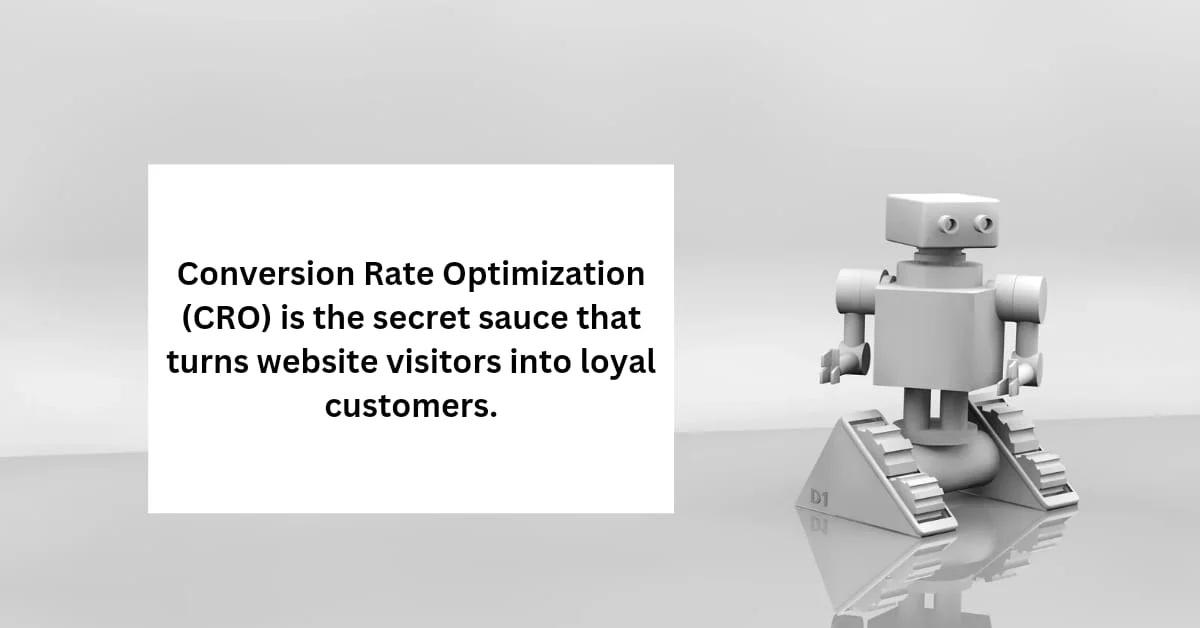
What is Form Conversion Optimization? Form conversion optimization is the process of fine-tuning your forms to maximize the number of users who complete them. At its core, it’s about reducing friction—removing obstacles that might cause someone to abandon a form—and guiding users smoothly through the process. When done correctly, it can transform an ordinary form into a conversion powerhouse, driving more leads, sales, or sign-ups with the same amount of traffic.
Form conversion optimization isn’t just about aesthetics or cutting down on form fields. It’s a strategic approach that involves understanding user behavior, addressing their pain points, and continuously testing and refining the form to meet their needs. It’s about making the user’s experience as effortless as possible while ensuring that the form serves its intended purpose.
Key Metrics to Track To effectively optimize your forms, you need to measure how they’re currently performing. Here are some key metrics that can provide valuable insights:
- Form Abandonment Rate: This metric indicates the percentage of users who start filling out your form but leave before completing it. A high abandonment rate suggests that something in your form is causing users to drop off.
- Conversion Rate: This is the percentage of users who successfully complete and submit the form. Tracking this rate over time helps you understand the effectiveness of your optimization efforts.
- Time on Form: Measuring how long it takes users to fill out the form can reveal whether your form is too long or complicated. Ideally, users should be able to complete the form quickly and efficiently.
By keeping a close eye on these metrics, you can identify areas for improvement and make data-driven decisions that enhance your form’s performance.
Best Practices for Optimizing form design that convert
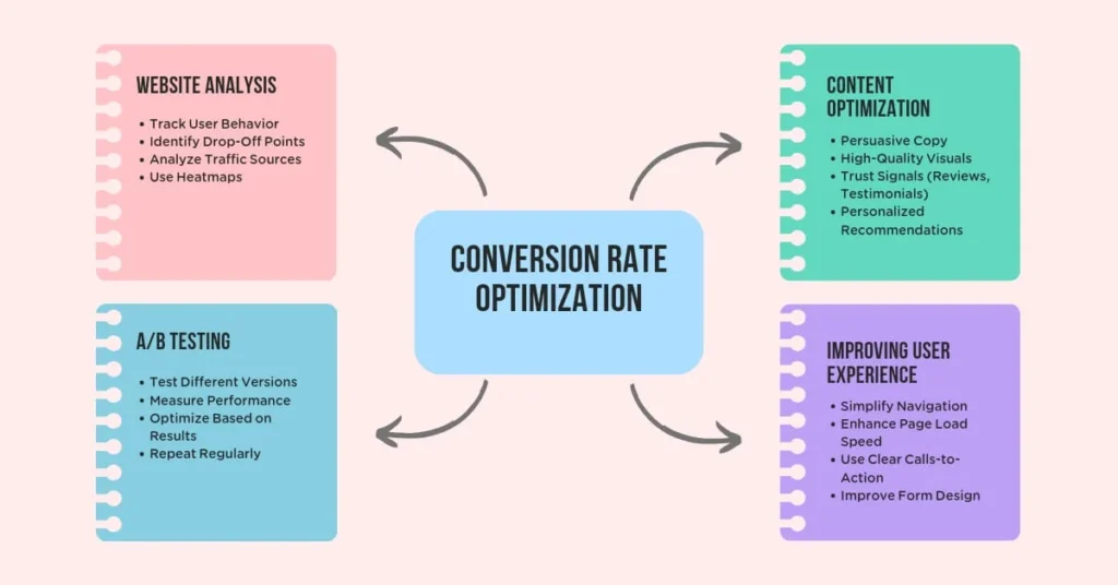
Simplify Form Fields One of the most effective ways to increase form submissions is to minimize the number of fields. Each additional field you ask a user to fill out adds friction, increasing the chances of abandonment. Focus on collecting only the essential information that you need at that moment. For instance, instead of asking for a full address upfront, consider asking for just the email and name, and gather more details later in the process.
When you reduce the number of fields, you not only make the form easier to complete but also demonstrate respect for the user’s time. This simplification leads to higher completion rates and, ultimately, more conversions.
Use Clear and Concise Labels Labels and instructions are your form’s communication tools. They guide users through the process and ensure they understand what’s required. Labels should be straightforward and easy to understand, avoiding jargon or technical terms that might confuse users.
For example, instead of “Please provide your domicile address,” simply use “Address.” Similarly, placeholder text within the fields can be helpful, but make sure it doesn’t replace proper labels, as placeholders disappear when users start typing, which can lead to confusion.
Leverage Progressive Disclosure Progressive disclosure is a design technique where you reveal additional fields or information as the user progresses through the form. This approach helps to avoid overwhelming the user with too many fields at once. For instance, you can start with basic fields like name and email, and then reveal more fields based on the responses or after the initial fields are completed.
This method keeps the form looking clean and manageable, while still allowing you to gather all the necessary information.
Implement Smart Defaults Smart defaults are pre-filled form fields based on previously collected data or common user behavior. For example, if your form requires users to select their country, you could default to the most common country based on the user’s location data. This small convenience can save users time and reduce the cognitive load, making the form-filling process smoother.
By anticipating user needs and preferences, smart defaults make forms faster and easier to complete, which can lead to higher submission rates.
Mobile Optimization With the increasing number of users accessing the internet via mobile devices, ensuring your forms are mobile-friendly is non-negotiable. A mobile-optimized form should be responsive, easy to navigate, and simple to complete on smaller screens.
This includes using larger, tappable buttons, minimizing text input fields, and enabling autofill where possible. Additionally, consider reducing the number of fields visible at one time to avoid overwhelming the user on a small screen. By prioritizing mobile optimization, you cater to a broader audience, which can significantly boost your conversion rates.
Design Elements That Enhance Form Usability
Logical Flow and Layout A well-organized form follows a logical flow, guiding the user seamlessly from one section to the next. The most effective forms typically use a single-column layout, which is easier for the eye to follow and prevents confusion. Group related fields together, such as contact information or payment details, to create a natural progression that feels intuitive.
This clear structure reduces the cognitive load on users, making it easier for them to complete the form without unnecessary distractions or confusion. The goal is to keep users focused, minimizing the chances of abandonment due to frustration or uncertainty.
Visual Cues and Error Handling Visual cues play a critical role in guiding users through your form. Use color, icons, or text to highlight required fields, which ensures that users don’t overlook essential information. Additionally, clear error messages are vital. When users make a mistake, such as leaving a required field empty or entering invalid data, your form should provide immediate feedback with specific guidance on how to correct it.
Effective error handling can prevent user frustration and abandonment by helping users resolve issues quickly. For example, displaying an error message next to the relevant field, along with a brief explanation, can guide users to make the necessary corrections without hassle.
Call to Action (CTA) Optimization The Call to Action (CTA) button is the final step in the form submission process, and it should be compelling and clear. A well-designed CTA button should stand out visually—using contrasting colors that draw the eye—and the text should be action-oriented and specific.
Instead of using generic phrases like “Submit,” opt for more engaging and descriptive language that reinforces the action the user is taking, such as “Get Your Free Quote” or “Join the Community.” Additionally, positioning the CTA button strategically—such as at the end of the form, where it’s easy to find—can further enhance usability and encourage submissions.
Testing and Analyzing Form Performance

A/B Testing Your Forms A/B testing is a powerful tool for optimizing form performance. By creating two or more versions of a form and testing them against each other, you can identify which design, layout, or wording resonates best with your audience. For example, you might test different versions of your CTA button—one with “Submit” and another with “Get Your Free Guide”—to see which drives more conversions.
A/B testing allows you to make data-driven decisions that can lead to significant improvements in form completion rates. It’s important to test one element at a time to accurately determine what’s driving the change in user behavior. This iterative process of testing and refining ensures your forms are always evolving to meet user needs.
Heatmaps and Analytics Tools Heatmaps and form analytics tools provide deep insights into how users interact with your forms. Heatmaps visually represent user behavior, showing you where users click, hover, or drop off within the form. This data can reveal areas of friction—such as fields that cause confusion or are frequently left blank—allowing you to make targeted adjustments.
Form analytics tools, like Google Analytics or specialized form analysis software, can track specific metrics such as completion rates, abandonment rates, and time on form. These insights help you understand how users are engaging with your form and where they might be encountering obstacles.
Iterative Improvements Optimization doesn’t end after a single round of testing. Continuous improvement is key to maintaining high form conversion rates. As user behavior and preferences evolve, so too should your forms. Regularly review your form performance data and conduct A/B tests to refine elements like field placement, CTA wording, or form length.
By adopting an iterative approach, you ensure that your forms remain effective over time, adapting to changing user expectations and technological advancements. This ongoing optimization process helps sustain high conversion rates and keeps your forms performing at their best.
In a Nutshell
Form optimization is a critical component of conversion rate optimization (CRO). By applying best practices in form design, you can significantly enhance the user experience, reduce abandonment rates, and drive higher submission rates. Simplifying form fields, using clear and concise labels, leveraging progressive disclosure, implementing smart defaults, and ensuring mobile optimization are all essential strategies to make your forms more effective.
Additionally, incorporating logical flow, strong visual cues, and compelling CTAs can further enhance form usability and encourage completions. However, the work doesn’t stop once your form is live. Continuous testing and analysis, through methods like A/B testing and heatmaps, are vital to refining your forms and keeping them optimized over time.
Incorporating these strategies into your form design process will not only improve your conversion rates but also create a more seamless and satisfying experience for your users. By making forms a frictionless part of the user journey, you turn a potential barrier into an opportunity for engagement and growth.